Button + Zipper
Desktop redesign for a non-profit coat drive serving the Denver and Chicagoland areas.
Overview
Button + Zipper is a community coat drive to collect and distribute coats and jackets for the homeless, at risk youth, and individuals living on the streets throughout the Chicago and Denver areas.
My goal was to provide support and recommendations to improve the overall experience, visual design, and increase usability improvements for the process of contributing.
Company Button + Zipper
Role UX Lead
Platform Web
Duration 3 months
Tools Sketch
Research
For many sites, especially non-profits, the homepage is the gateway to the brand. The mission, transparency, and ability to build trust for a non-profit to convey to its user base is of most importance.
I was tasked with giving the website a modern look and feel. I started my research by studying other non-profit organizations to grasp a better understanding of their missions and goals. Each non-profit has its own unique purpose. I was interested in learning how to get people excited about supporting a specific cause, and how to give them a sense of feeling that their contribution and involvement matters, and the impact it can make.
I was tasked with giving the website a modern look and feel, and after meeting with the client, we agreed on the following requirements.
Project Scope
Meeting with the client, we were able to outline the main focus of the redesign through a focus on the following design principles.
Compelling Content
Concise + well written copy
Attention Grabbing
Through imagery + excitement
Useful Functionality
Simplify UX overall and specifically the contribution
Ideation
I started by creating a site map for the current state of Button + Zipper’s website. I was able to find opportunities to simplify the overall architecture of the site. Below is an example of an updated site map which was implemented.


Volunteer Form
Before
One of the goals was to see how we could increase the number of volunteers. Simplifying the volunteer form to increase user conversions was essential to make this happen. A lot of information being asked of users was not essential to have them volunteer. I suggested that we minimize the amount of information and time it would take for a user to complete a volunteer form.
Volunteer Form
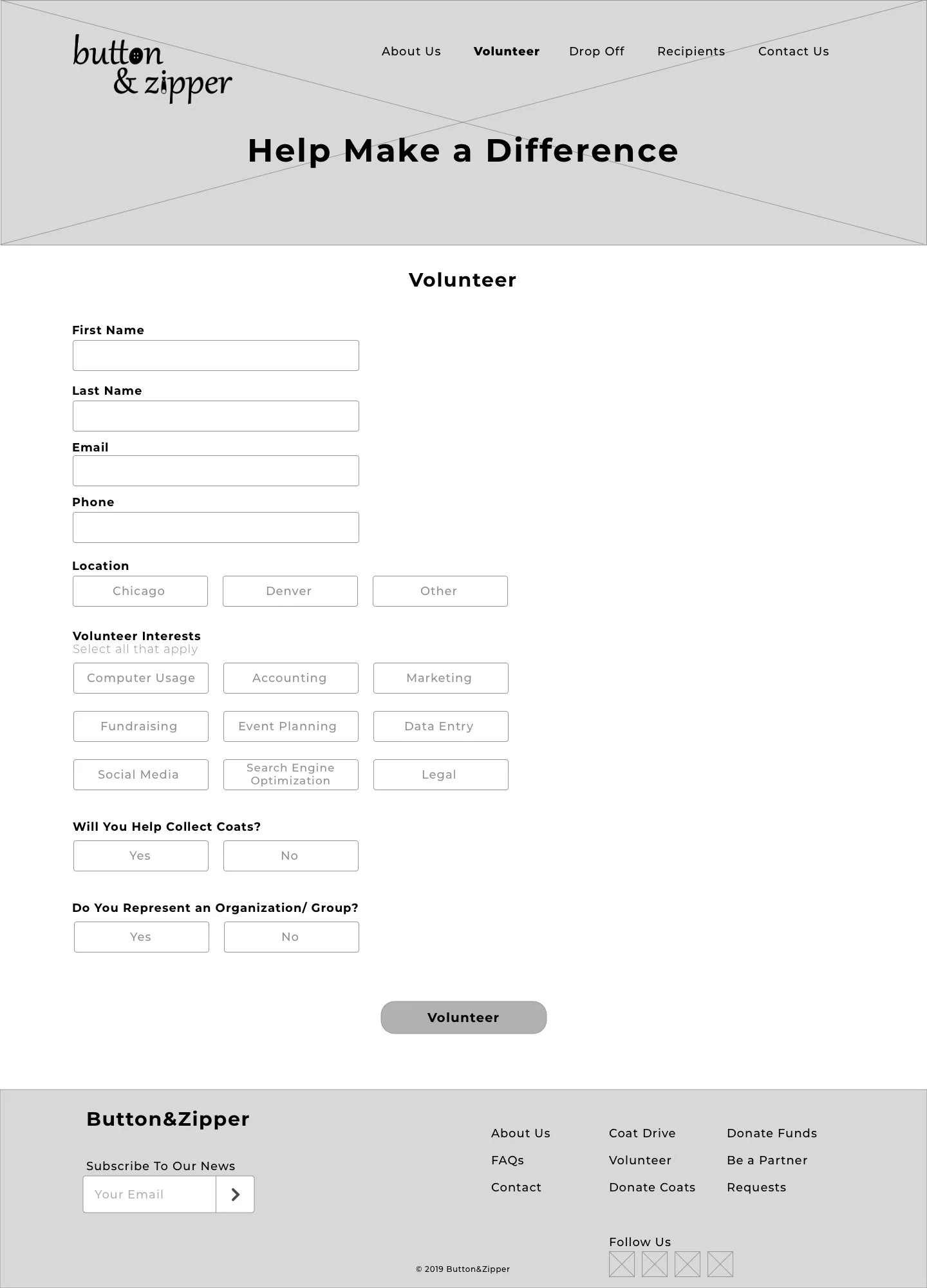
After
I suggested that the labels to be top left aligned. From researching best practices for forms, it is a proven fact that this is one of the best way’s to layout a form to increase readability and completion.
Removing unnecessary fields increased the completion rate. One of the ways I was able to minimize the volunteer form was with conditional logic by not displaying questions that may be irrelevant to certain types of users.
For example, previously the volunteer form had form fields to input the address and name for users who represent an organization or group. Conditional logic allows to display a question to users dependant on how a previous question has been answered. This reduces the length of the form and form abandonment.
Another improvement included the addition of a clear CTA button at the bottom of the form to volunteer.
Home Page
Before
The homepage initially had links and no true call to action. It was difficult to distinguish between what was and wasn’t clickable.
Home Page
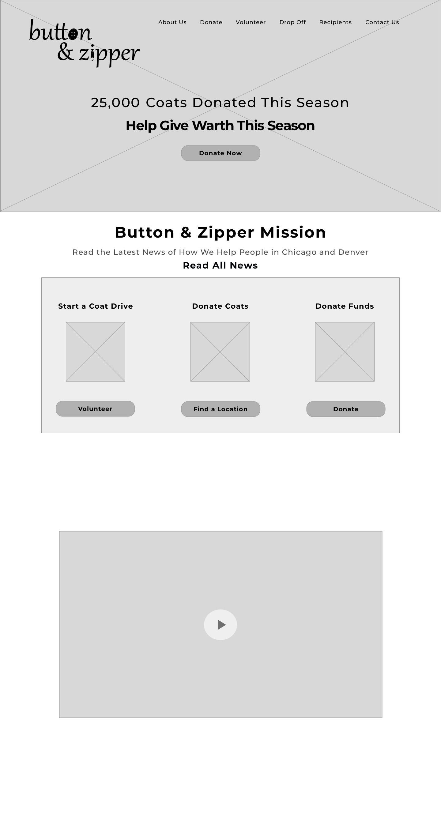
After
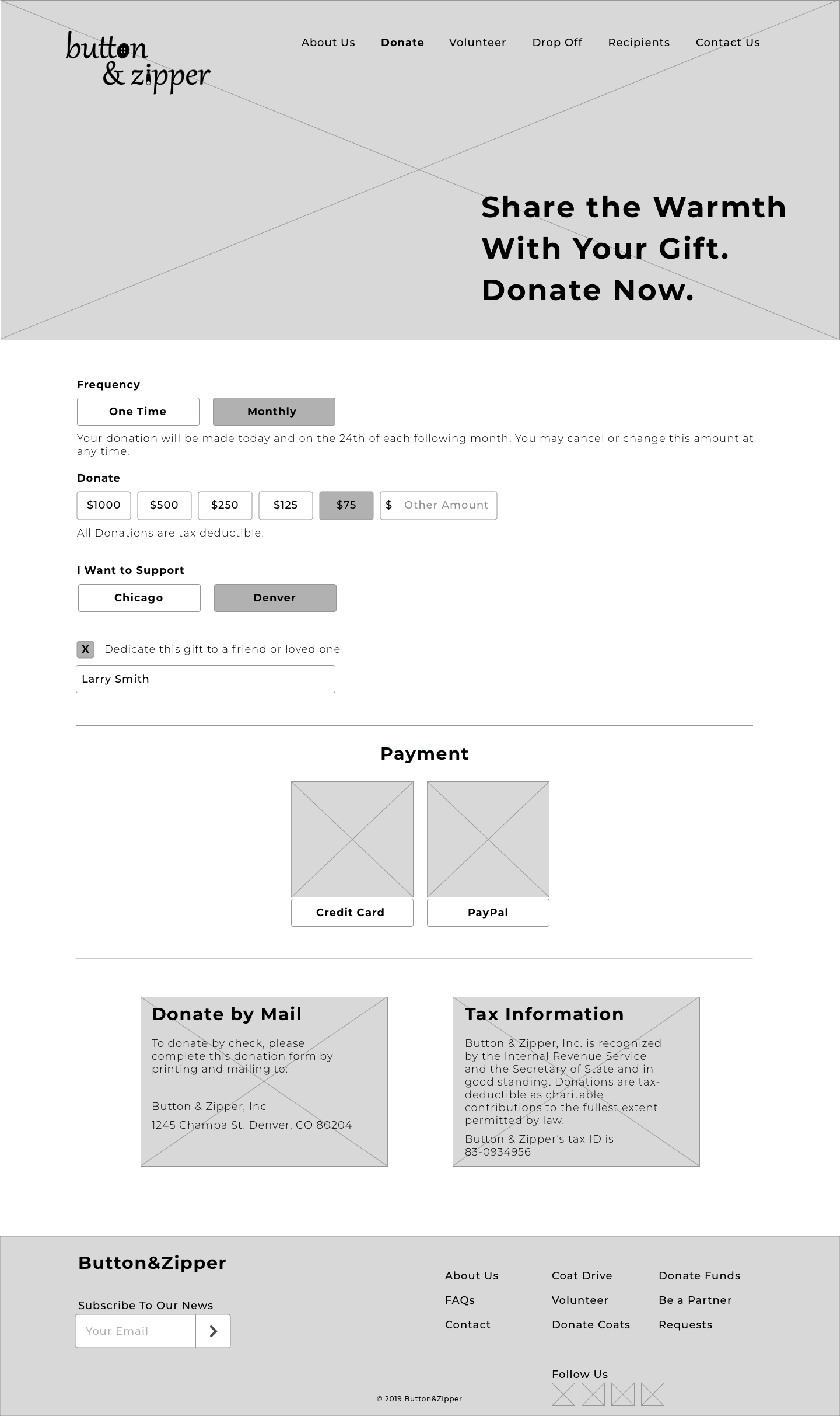
I provided a call to action to donate and aligned the header with the Button + Zipper logo to provide hierarchy into what users can click on. Giving users a simple way to understand information and separating sections to easily scan the page around who Button + Zipper is and what their mission is, but most importantly for users who visit the site an understanding of how they can help those in need, which was the main goal for my client.


